Creating a good email is not an easy task.
For those who don't have an affinity for writing, it can be difficult to piece together everything you want to say.
But don't lose sight of the purpose of your email: As the organizer, your guests get to decide whether they will be present. Always keep this in mind when writing your email.
In order for your guests to read and respond to your invitation mail, it is essential to work thoroughly on both parts that make a good email a great one:
1) The Form
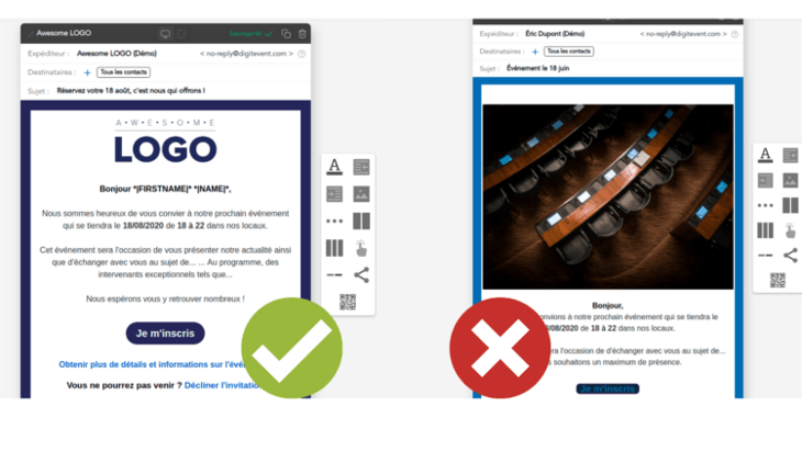
The form of an email is how it appears to readers. This is an element that is all too often neglected when crafting an email, but it's an important one. Guests are more likely to click on aesthetically designed emails than on a body of text without any "soul."
It must be pleasing to the eye, so avoid flashy elements as they may disturb the person reading your email.
With this in mind, you can work with your own HTML editor or use Drag & Drop: this tool allows you to personalize every single detail. You can as well use the one proposed by Digitevent :

- Feel free to insert images, company banners, logos, or any other graphic element of branding. Also, remember to edit the sender's name and to put your company name (you can find it as Digitevent's white-label feature).
- The spacing of your email is also a detail not to be taken lightly: Avoid "paved" emailing and as well as emails with too much spacing. You don't need 2 line breaks after each sentence!
- If possible, try to start your email with humor, an anecdote about your company's news, or another current event (even a GIF or emojis, anything is possible).
- Furthermore, it seems obvious that spelling mistakes can put a huge wrench in the credibility of your email, as well as the credibility of your entire event. Don't forget that your registration email is often the first link between your event and your audience. So don't neglect spelling or grammar, which could smear all the work you've done beforehand. We advise you to write your email beforehand on Google Docs or to pass it on to any error detection software.
- The registration buttons, often at the end of emails, also known as Call To Action must have enough visual contrast so that they can be easily read. Try to apply a consistent style (all buttons have square/round borders; all have the same font, etc.) so as not to lose your reader with different graphic styles. Digitevent offers a theme feature that allows you to create a pleasant graphic chart.
- Test and proofread your email on all web browsers as well as on mobile and tablet devices to make sure it looks responsive.
- Validate with your CIO (in case of an internal event) the deliverability of your email, and add the domain in "whitelist" (this is made possible on Digitevent) for an excellent deliverability rate.
- Do you segment the contacts to whom you send your communications? This allows you to send personalized messages to different types of audiences contained in the same contact database to optimize your click-through rates.
- Be careful not to send invitations to contacts who are already registered! You must therefore use software that can avoid errors and duplicates (in Digitevent, the software automatically detects duplicate emails and avoids them).
2) The Content
Your email doesn't just have to be beautiful and pleasing to the eye. In fact, the form is now a basic prerequisite for good emailing scores.
The idea, in short, is to make people want to click, through a body of text that has an impact and is as personalized as possible (for this we will use the variables in the contact base).
Thus, your communications are differentiated through their content:
- Is your event email really meaningful?
- Do you explain what the guest will get out of participating so that your audience feels engaged?
- Make your readers want to go to events: Use action verbs, write in a dynamic tone and turn your negative sentences "Don't hesitate to stop by!" into positive sentences such as "Come by and say hello".
- Did you briefly explain the program?
- Are your dates clear and easily understood in your body of text and on your landing page (the landing page for event registration)?
If so, your emails should be successful and your event registration rate should be good (a good registration rate is 50%).
Conclusion :
For your email to be effective, reassure your contacts by using your graphic chart, make sure that your email is proofread by your colleagues, and make sure that you explain the intrigue of your event to your contacts, as well as the place and date of your event.
A little something extra for internal events: you will be in daily contact with your colleagues and they are used to opening your emails regularly. You should therefore not be scared off by a low opening rate.
You are now ready to send a nice corporate event invitation email! Don't hesitate to do it with Digitevent's email sending tool for even more simplicity.


