Your event's website is often your first interaction with future participants. It reflects the first contact between your event and your attendees and gives a preview of the professionalism of your upcoming event.
As an event organizer, you should be inspired by UX design techniques to optimize the user experience.
A well-designed website will increase your registration, participation, and interaction statistics, as we've seen in our experience.
The purpose of your event website is similar to a landing page because the goal is the same: to give information, create a desire to attend, and get registrations.
Here are 6 best practices to design (with ease) a flawless event website:
Use a graphic chart 🎨
One of the first things an attendee will see when they arrive at your event website is its colors and overall coherence.
Identify the colors of your graphic chart and stick to them at all costs. If you don't have a graphic chart yet, start there. Make sure you choose the right contrasting colors, the right font, and other graphic elements that stand out at first glance.
Also, make sure you don't illustrate your website with graphic objects of different families (some icons in flat design and others in 3d for example) in order to avoid aesthetic embarrassment.
To define this (if it is not already defined in the chart of your company), you have many free tools such as the palette explorer (which gives you harmonious tones), the color harmony tool of Adobe, or Google Font catalog.
Once these choices are made, go to the visual identity parameter of your event:
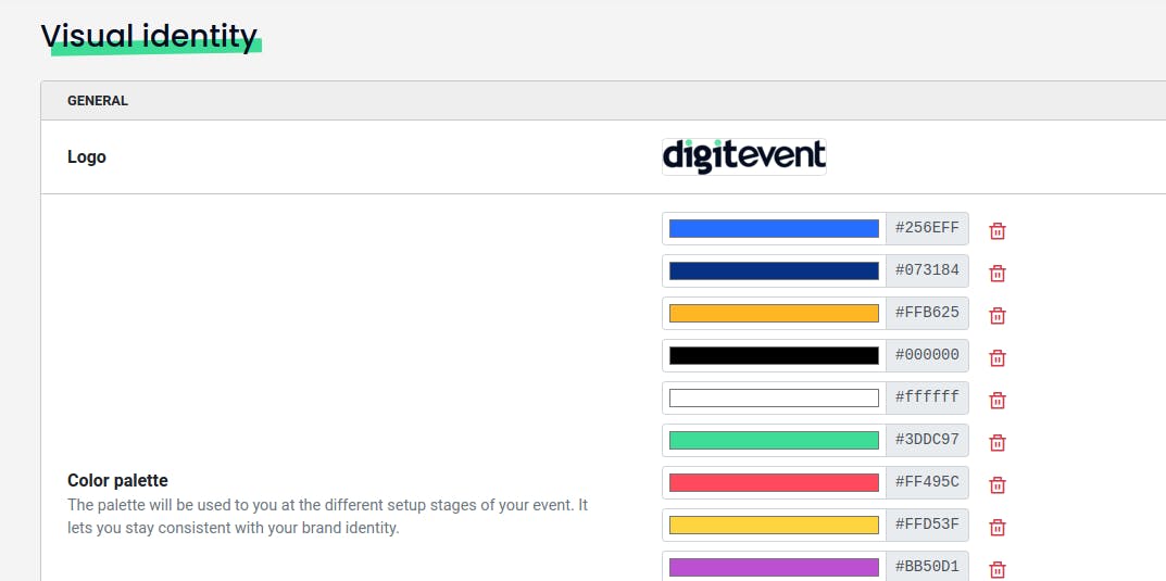
While you can have many colors in your palette, it is advisable to use a maximum of 5 on your website. Defining this chart as early as possible in the creation of your website is crucial to avoid wasting time later on.
Think about the user journey ⛰️
When creating an event website, it is essential to anticipate your attendee's journey. Focus on the concrete benefits of your event, what will they learn, what the overall purpose is.
Obviously, mention the essentials (where, when, how to get there) as well as a brief overview of the event's subject.
Always ask yourself what information is most relevant to showcase, and how to build harmony between all these elements and information, being careful not to overload the pages.
Anticipate the participant's journey: are the "Call To Action" buttons clearly visible and highlighted? Are there any imperfect alignments?
Use Templates (New Digitevent Feature 👀)
Templates are a new feature that required a lot of R&D at Digitevent and is the result of long-term work between our design team, our developers, and our user's feedback.
The templates allow you to add modular and aesthetic bricks to easily design your website.
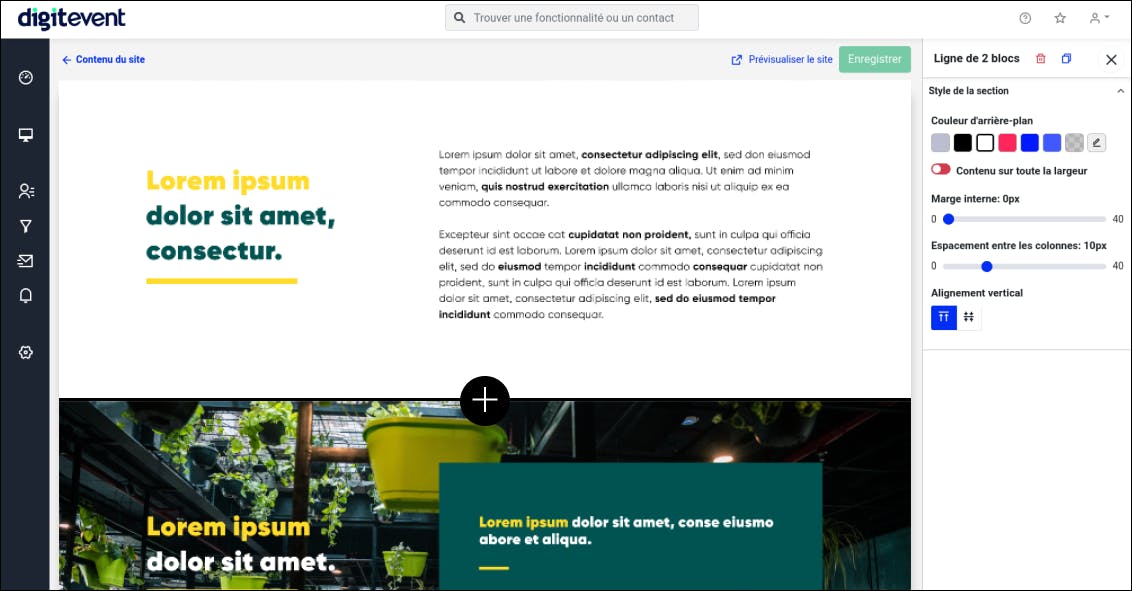
Created in partnership with an art director, these Compositions use "F or Z structures," which are one of the best ways to get conversions up on a web page:
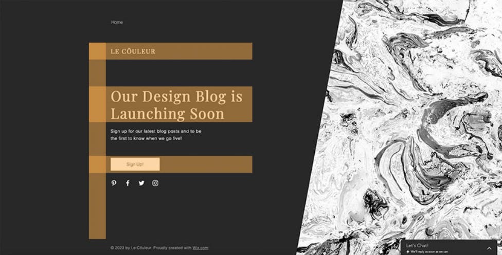
Example of a page in F shape, Wix photo credits
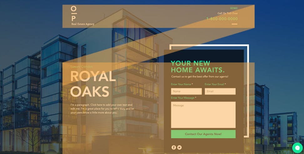
Example of a page in a Z shape, Wix photo credits
This page structure refocuses participants on the objective of your website: the registration to your event.
Illustrate your website 🖌️
A website with images and illustrations will be more successful than a dull website that only uses text: illustrate your words with quality images with consistent themes (take a look at unsplash).
Digitevent's advantage: no image size is restricted, your pictures are automatically adapted to the screen size of your participant.
Here is an example that shows you that a well-illustrated site is much more pleasant to navigate than an "empty" website:
Here is an example of a well-illustrated website
Here is an example of a poorly illustrated website
Check the alignments 📐
Keeping consistency in mind throughout your guests' web experience, we recommend creating standard elements that you will use throughout your event.
It is fundamental to maintain the same size headings, paragraphs, margins, borders, and spacing throughout your pages and elements.
Always use the same button styles to ensure a harmonious result.
The keyword when adjusting your website: standardize.
Leave no room for exceptions, and you will ensure a consistent web experience.
Test and retest everything! ✏️
Finally, it is essential to test your website well (from a user perspective).
To do this, ask 5 colleagues to visit your event website, preferably with 5 different devices and browsers. Don't say anything during the whole test and listen to every remark, and note every difficulty your colleagues encounter.
Also, remember to proofread the texts to avoid any typo or syntax errors...
This step is crucial to being able to send out your registration invitations with peace of mind.
Have the guarantee of a secure and RGPD compliant website 🔐
You can use your website to collect relevant information about your participants. It is possible for you to link it to a Google Analytics account, and thus to deposit cookies.
To stay in compliance with the RGPD, you must obtain consent and detail your privacy policy.
Also, check that your website is secure and in HTTPS.
Conclusion
Digitevent allows you to have the flexibility of a customizable website creator while combining it with the robustness of protocols guaranteeing maximum security.
We hope that these few tips will give you a better vision of the steps and best practices to know in order to create a beautiful event website and guarantee a high registration rate :)
